twitter conference presentation
I thought I’d talk about the analyses I conducted for my submission to the American Public Health Association Physical Activity Section’s Twitter Conference. I thought it was a fun opportunity to disseminate some analyses that I conducted using public data from the County Health Rankings and Roadmap to examine what factors are associated with leisure-time physical activity (LTPA) in counties in California from 2016 to 2020. If you are interested in the presentation itself, you can follow it here.
Physical activity is important as its related to many physical and mental health conditions. It is also a health behavior that can be modified slightly easier than other health behaviors. While not as beneficial as extended periods of exercise, even walking for leisure can be beneficial for one’s health. I was predominately interested in California because I wanted to know how much variation there was between the counties. For instance, there are areas like San Francisco county and Los Angeles County, which may be seen as hubs for cultures of being physically active, but what about counties throughout Central California. I’m also interested in LTPA engagement because this health behavior has several social determinants of health that impact how much LTPA individuals can engage in. The social determinant that I’m most interested in is the role that access to recreational facilities and parks have on counties' LTPA engagement. Since I was interested in looking at variation between counties while also examining the longitudinal association between access and LTPA, I decided to create a two-level multilevel model with time (level 1) nested within counties (level 2).
Packages ued
## -- Attaching packages --------------------------------------- tidyverse 1.3.0 --
## v ggplot2 3.3.3     v purrr   0.3.4
## v tibble  3.1.1     v dplyr   1.0.5
## v tidyr   1.1.3     v stringr 1.4.0
## v readr   1.4.0     v forcats 0.5.1
## Warning: package 'ggplot2' was built under R version 4.0.4
## Warning: package 'tibble' was built under R version 4.0.5
## Warning: package 'tidyr' was built under R version 4.0.5
## Warning: package 'dplyr' was built under R version 4.0.5
## Warning: package 'forcats' was built under R version 4.0.5
## -- Conflicts ------------------------------------------ tidyverse_conflicts() --
## x dplyr::filter() masks stats::filter()
## x dplyr::lag()    masks stats::lag()
##
## Attaching package: 'psych'
## The following objects are masked from 'package:ggplot2':
##
##     %+%, alpha
## Loading required package: Matrix
##
## Attaching package: 'Matrix'
## The following objects are masked from 'package:tidyr':
##
##     expand, pack, unpack
##
## Attaching package: 'lmerTest'
## The following object is masked from 'package:lme4':
##
##     lmer
## The following object is masked from 'package:stats':
##
##     step
## Google's Terms of Service: https://cloud.google.com/maps-platform/terms/.
## Please cite ggmap if you use it! See citation("ggmap") for details.
##
## Attaching package: 'maps'
## The following object is masked from 'package:purrr':
##
##     map
## Warning: package 'gganimate' was built under R version 4.0.4
## Warning: package 'transformr' was built under R version 4.0.5
Functions
Before beginning I created a simple function to get the intraclass correlation coefficient (ICC). I also included a function to get data from the 5 years of County Health Rankings data. The function to get the ICC from random-intercept models is the between county variation divided by the total variation between counties and within counties. This gives you information about how much of the variation in the model can be attributed to differences between counties regarding your outcome. Random-intercept models were tested because I was only interested in knowing the variation in counties' LTPA engagement. There were also not enough points for each county to test individual slopes for each county (random-slopes model).
I also made some slight changes to my data. The first was to get rid of the estimates for each state and only focus on estimates from the county. I also wanted to treat year as a continuous variable in my models but wanted to keep the year variable as a factor too. Then after filtering to only examine California counties I used the str_replace_all function from the stringr package to get rid of the county name after each observation. This was to make it easier to join with map data from the maps package. Lastly, I made the counties title case to also make joining the observations easier.
Models
Now when running the first model, I was first interested in examining if there was an increase in LTPA engagement in all California counties from 2016 to 2020. From the finding below, it shows that in California, there was a decrease in LTPA over that time. It’s also important to note that lmerTest and lme4 both have a lmer function. By namespacing them with two colons, you can see that the summary information is slightly different.
preliminary_ltpa_long <- lmerTest::lmer(ltpa_percent ~ year_num + (1 | county_fips_code), data = ca,
                              REML = FALSE)
summary(preliminary_ltpa_long)
## Linear mixed model fit by maximum likelihood . t-tests use Satterthwaite's
##   method [lmerModLmerTest]
## Formula: ltpa_percent ~ year_num + (1 | county_fips_code)
##    Data: ca
##
##      AIC      BIC   logLik deviance df.resid
##   1427.9   1442.5   -709.9   1419.9      286
##
## Scaled residuals:
##     Min      1Q  Median      3Q     Max
## -5.6854 -0.3709  0.0361  0.5377  1.7084
##
## Random effects:
##  Groups           Name        Variance Std.Dev.
##  county_fips_code (Intercept) 7.187    2.681
##  Residual                     5.174    2.275
## Number of obs: 290, groups:  county_fips_code, 58
##
## Fixed effects:
##               Estimate Std. Error         df t value            Pr(>|t|)
## (Intercept) 1923.40172  190.60225  231.84941  10.091 <0.0000000000000002 ***
## year_num      -0.91276    0.09445  231.84760  -9.664 <0.0000000000000002 ***
## ---
## Signif. codes:  0 '***' 0.001 '**' 0.01 '*' 0.05 '.' 0.1 ' ' 1
##
## Correlation of Fixed Effects:
##          (Intr)
## year_num -1.000
prelim_ltpa_lmer <- lme4::lmer(ltpa_percent ~ year_num +(1 | county_fips_code), data = ca,
                              REML = FALSE)
summary(prelim_ltpa_lmer)
## Linear mixed model fit by maximum likelihood  ['lmerMod']
## Formula: ltpa_percent ~ year_num + (1 | county_fips_code)
##    Data: ca
##
##      AIC      BIC   logLik deviance df.resid
##   1427.9   1442.5   -709.9   1419.9      286
##
## Scaled residuals:
##     Min      1Q  Median      3Q     Max
## -5.6854 -0.3709  0.0361  0.5377  1.7084
##
## Random effects:
##  Groups           Name        Variance Std.Dev.
##  county_fips_code (Intercept) 7.187    2.681
##  Residual                     5.174    2.275
## Number of obs: 290, groups:  county_fips_code, 58
##
## Fixed effects:
##               Estimate Std. Error t value
## (Intercept) 1923.40172  190.60225  10.091
## year_num      -0.91276    0.09445  -9.664
##
## Correlation of Fixed Effects:
##          (Intr)
## year_num -1.000
ltpa_null_icc <- as_tibble(VarCorr(preliminary_ltpa_long))
ltpa_null_icc
## # A tibble: 2 x 5
##   grp              var1        var2   vcov sdcor
##   <chr>            <chr>       <chr> <dbl> <dbl>
## 1 county_fips_code (Intercept) <NA>   7.19  2.68
## 2 Residual         <NA>        <NA>   5.17  2.27
county_icc_2level(ltpa_null_icc)
## [1] 0.5814093
Along with the fixed effects, we also got our random effects for both differences found between counties for LTPA engagement and differences within counties for LTPA engagement. This shows that there was a good amount of variation between counties (σ2 = 7.19) but also a large amount of variation within each county in California (σ2 = 5.17). Using the function to calculate the ICC, it found that county differences attributed to 58% of the variation in LTPA engagement. Something that should be considered is the potential for heteroscedastic residual variance at level 1. There is also the issue that the residuals could suggest spatial autocorrelation or clustering within these counties. Maybe I’ll create something on these soon. But for the time being, lets move on to what was found for the twitter conference.
ltpa_long_access <- lmer(ltpa_percent ~ year_num + violent_crime + obesity_percent + median_household_income + rural_percent +
                           access_pa_percent + (1 | county_fips_code), data = ca,
                         REML = FALSE)
## Warning: Some predictor variables are on very different scales: consider
## rescaling

## Warning: Some predictor variables are on very different scales: consider
## rescaling
anova(preliminary_ltpa_long, ltpa_long_access)
## Data: ca
## Models:
## preliminary_ltpa_long: ltpa_percent ~ year_num + (1 | county_fips_code)
## ltpa_long_access: ltpa_percent ~ year_num + violent_crime + obesity_percent + median_household_income +
## ltpa_long_access:     rural_percent + access_pa_percent + (1 | county_fips_code)
##                       npar    AIC    BIC  logLik deviance  Chisq Df
## preliminary_ltpa_long    4 1427.9 1442.5 -709.93   1419.9
## ltpa_long_access         9 1237.4 1270.4 -609.69   1219.4 200.47  5
##                                  Pr(>Chisq)
## preliminary_ltpa_long
## ltpa_long_access      < 0.00000000000000022 ***
## ---
## Signif. codes:  0 '***' 0.001 '**' 0.01 '*' 0.05 '.' 0.1 ' ' 1
other_var <- lmer(ltpa_percent ~ year_num + violent_crime + obesity_percent + median_household_income + rural_percent + (1 | county_fips_code), data = ca,
                         REML = FALSE)
## Warning: Some predictor variables are on very different scales: consider
## rescaling

## Warning: Some predictor variables are on very different scales: consider
## rescaling
anova(other_var, ltpa_long_access)
## Data: ca
## Models:
## other_var: ltpa_percent ~ year_num + violent_crime + obesity_percent + median_household_income +
## other_var:     rural_percent + (1 | county_fips_code)
## ltpa_long_access: ltpa_percent ~ year_num + violent_crime + obesity_percent + median_household_income +
## ltpa_long_access:     rural_percent + access_pa_percent + (1 | county_fips_code)
##                  npar    AIC    BIC  logLik deviance  Chisq Df Pr(>Chisq)
## other_var           8 1240.1 1269.4 -612.04   1224.1
## ltpa_long_access    9 1237.4 1270.4 -609.69   1219.4 4.6883  1    0.03037 *
## ---
## Signif. codes:  0 '***' 0.001 '**' 0.01 '*' 0.05 '.' 0.1 ' ' 1
With the inclusion of several predictors for fixed effects, a likelihood ratio test was conducted to see if the inclusion of these fixed effects revealed a significantly better fitting model. The inclusion of these predictors revealed a better fitting model. It would probably be better to see if the inclusion of one variable of interest, such as access, resulted in a better fitting model than a model with the other social determinants of health. As can be see here, the likelihood ratio test of including only access still resulted in a signifcantly better fitting model.
summary(ltpa_long_access)
## Linear mixed model fit by maximum likelihood . t-tests use Satterthwaite's
##   method [lmerModLmerTest]
## Formula:
## ltpa_percent ~ year_num + violent_crime + obesity_percent + median_household_income +
##     rural_percent + access_pa_percent + (1 | county_fips_code)
##    Data: ca
##
##      AIC      BIC   logLik deviance df.resid
##   1237.4   1270.4   -609.7   1219.4      281
##
## Scaled residuals:
##     Min      1Q  Median      3Q     Max
## -4.8388 -0.5546  0.0010  0.6179  2.4921
##
## Random effects:
##  Groups           Name        Variance Std.Dev.
##  county_fips_code (Intercept) 1.286    1.134
##  Residual                     3.139    1.772
## Number of obs: 290, groups:  county_fips_code, 58
##
## Fixed effects:
##                               Estimate     Std. Error             df t value
## (Intercept)             1138.319788532  193.185926311  289.534084001   5.892
## year_num                  -0.517087679    0.096244053  289.365967843  -5.373
## violent_crime             -0.001434185    0.001190066   82.732732827  -1.205
## obesity_percent           -0.602338792    0.043760246  262.840285406 -13.765
## median_household_income    0.000004822    0.000014701  102.255260100   0.328
## rural_percent             -0.012178273    0.007671490   63.272282539  -1.587
## access_pa_percent          0.027194696    0.012124625  153.692013407   2.243
##                                     Pr(>|t|)
## (Intercept)                     0.0000000106 ***
## year_num                        0.0000001597 ***
## violent_crime                         0.2316
## obesity_percent         < 0.0000000000000002 ***
## median_household_income               0.7436
## rural_percent                         0.1174
## access_pa_percent                     0.0263 *
## ---
## Signif. codes:  0 '***' 0.001 '**' 0.01 '*' 0.05 '.' 0.1 ' ' 1
##
## Correlation of Fixed Effects:
##             (Intr) yer_nm vlnt_c obsty_ mdn_h_ rrl_pr
## year_num    -1.000
## violent_crm  0.116 -0.118
## obsty_prcnt  0.489 -0.494 -0.100
## mdn_hshld_n  0.586 -0.589  0.203  0.452
## rural_prcnt  0.260 -0.264  0.135  0.203  0.447
## accss_p_prc -0.147  0.142 -0.018  0.054 -0.341  0.158
## fit warnings:
## Some predictor variables are on very different scales: consider rescaling
The model summary suggests that the fixed effect of access on LTPA engagement was significantly associated. The thing that stands out the most here is that the inclusion of the predictors resulted in more variation within counties than between counties. So lets look into that more closely.
ltpa_access_icc <- as_tibble(VarCorr(ltpa_long_access))
ltpa_access_icc
## # A tibble: 2 x 5
##   grp              var1        var2   vcov sdcor
##   <chr>            <chr>       <chr> <dbl> <dbl>
## 1 county_fips_code (Intercept) <NA>   1.29  1.13
## 2 Residual         <NA>        <NA>   3.14  1.77
county_icc_2level(ltpa_access_icc)
## [1] 0.2906253
The ICC suggests that 29% of the variation explained is from differences between counties. It is also beneficial to look at all of this through visuals.
Visuals Prep
Below we’ll start by using the maps package to get county-level data of the contiguous United States. The steps below were to make sure this data frame joined with the county health rankings data we had created previously.
Visualizing model
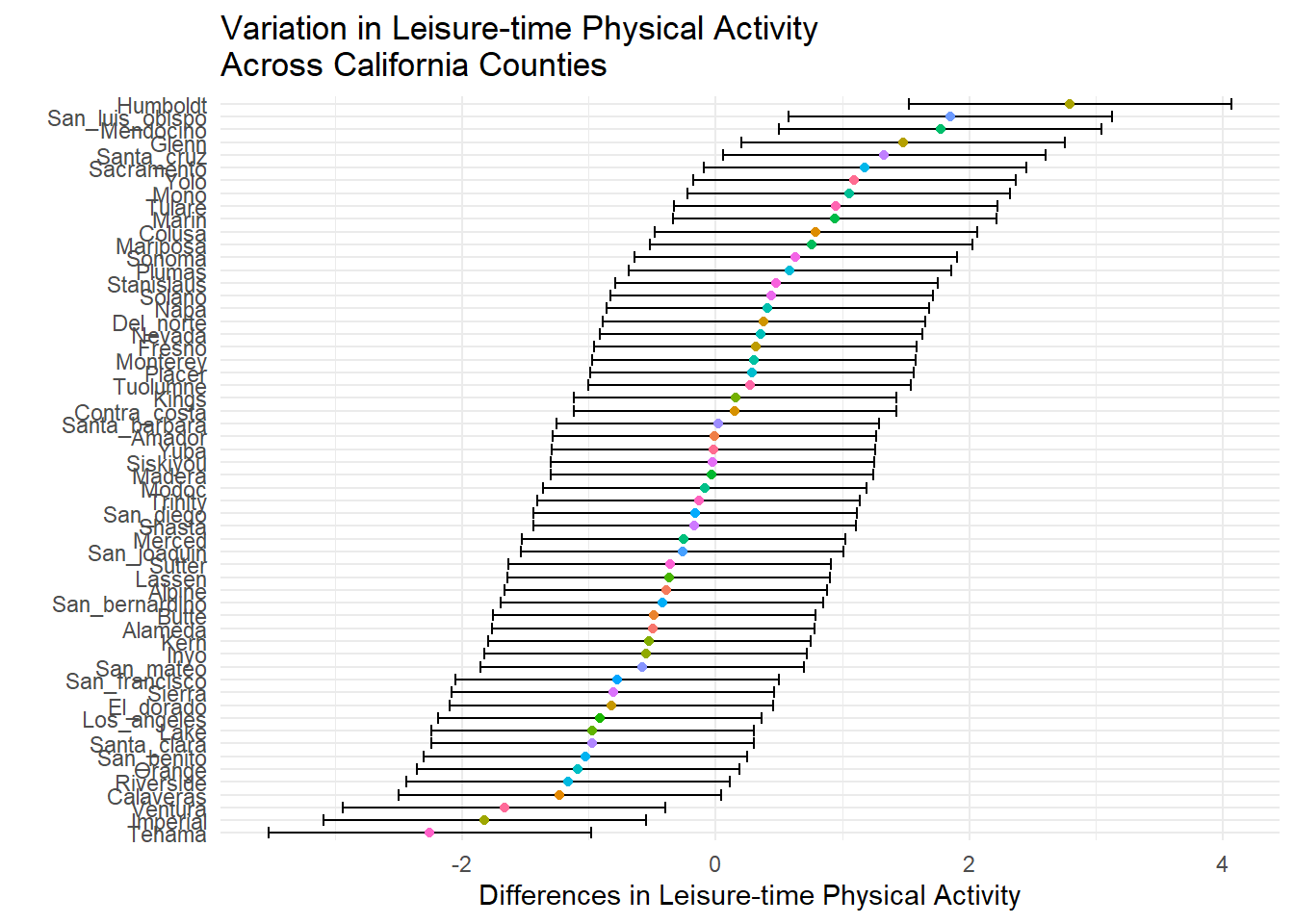
One way to visualize the variation between counties in our final model (ltpa_long_access) is to use a caterpillar plot. This allows you to view variation in the residuals of each county for your outcome. From the visual, you can see the differences between Humboldt County and Tehama County.
main_effects_var <- ranef(ltpa_long_access, condVar = TRUE)

main_effects_var <- as.data.frame(main_effects_var)

main_effects_var <- main_effects_var %>%
  mutate(main_effects_term = term,
         county_fips_code = grp,
         main_effects_diff = condval,
         main_effects_se = condsd,
         county_fips_code = as.numeric(county_fips_code))

main_effects_var$no_name_county <- unique(ca$no_name_county)

main_effects_var %>%
  ggplot(aes(fct_reorder(no_name_county, main_effects_diff), main_effects_diff)) +
  geom_errorbar(aes(ymin = main_effects_diff + qnorm(0.025)*main_effects_se,
                  ymax = main_effects_diff + qnorm(0.975)*main_effects_se)) +
  geom_point(aes(color = no_name_county)) +
  coord_flip() +
  labs(x = ' ',
     y = 'Differences in Leisure-time Physical Activity',
     title = 'Variation in Leisure-time Physical Activity\nAcross California Counties') +
  theme(legend.position = 'none')
This plot shows the fixed effect of access and LTPA across the various years.
ca %>%
  mutate(year = as.factor(year)) %>%
  ggplot(aes(access_pa_percent, ltpa_percent)) +
  geom_point(aes(color = year)) +
  geom_smooth(color = 'dodgerblue',
            method = 'lm', se = FALSE, size = 1) +
  theme(legend.title = element_blank()) +
  labs(x = 'Access to Physical Activity Opportunities',
       y = 'Leisure-time Physical Activity',
       title = 'The Statewide Association of Access\nand Physical Activity')
## `geom_smooth()` using formula 'y ~ x'

Finally, a gif of the change of LTPA from 2016 to 2020.
library(gganimate)

ca_animate <- ca_visual %>%
  ggplot(aes(frame = year,
             cumulative = TRUE)) +
  geom_polygon(aes(x = long, y = lat,
                   group = group,
                   fill = ltpa_percent),
               color = 'black') +
  scale_fill_gradientn(colors = brewer.pal(n = 5, name = 'RdYlGn')) +
  theme_classic() +
  transition_time(year) +
  labs(x = 'Longitude',
       y = 'Latitude',
       title = 'Leisure-time Physical Activity\nChange Over Time',
       subtitle = 'Year: {frame_time}') +
  theme(legend.title = element_blank(),
        legend.text = element_text(size = 12),
        axis.text.x = element_text(size = 10),
        axis.text.y = element_text(size = 10),
        plot.title = element_text(size = 20),
        plot.subtitle = element_text(size = 18))

library(gifski)
## Warning: package 'gifski' was built under R version 4.0.5
animate(ca_animate, renderer = gifski_renderer())

Jonathan A. Pedroza (JP)
Lecturer in Psychology at Cal Poly Pomona
My research interests revolve around addressing health inequities in underrepresented populations.